Modeling time trends in disease incidence with the 'surveil' R package
This post introduces the ‘surveil’ R package for modelling time trends in disease incidence or mortality, including age-standardization, percent change analyses, and other quantities of interest.
‘surveil’ requires fairly minimal R programming skills. If you download disease or mortality data from the CDC Wonder database, you’ll find that the file is automatically in the correct format to start modeling with ‘surveil’.
Among my motivations for developing the software was to provide an accessible alternative to join-point regression, which is a standard method in public health (and especially cancer prevention) research. The advantages over join-point include the use direct (rather than indirect) age-standardization, more appropriate measures of uncertainty, and the ability to make inferences about all sorts of (derived) quantities of interest including change over time and health disparities.
The models were built using the probabilistic programming language Stan.
Contents:
- Installation
- Models for time trends
- Illustration: fitting time trend models
- Viewing results
- Custom plots with base R
- Percent change analysis
- Age standardized rates
- Custom quantities of interest
- Citing ‘surveil’
Installation
You can install ‘surveil’ from R by calling:
install.packages("surveil")Models for time trends
The models implemented in ‘surveil’ have two components or levels: first is a Poisson or binomial likelihood for the number of cases (deaths or disease incidence), accounting for chance variation around the trend-level of risk. The second component is a model for the time trend in the level of risk itself (a prior probability for the rates). The model used for the time trends is known variably as the random-walk, first difference, or intrinsic autoregressive model.
For the Poisson likelihood, this can also be described as
\[y_t \sim Poisson(p_t \cdot \lambda_t)\]where \(y_t\) is the count of cases (or deaths), \(p_t\) is the number of people at risk, and \(\lambda_t\) is the rate of incidence. The subscript \(t\) indexes the time period. The likelihood says, 'I expect the crude incidence rates, \( y_t / p_t \), to be somewhere in the neighborhood of the trend rate \(\lambda_t\); and, in small populations the crude rates will be more variable and noisy than in large populations'.
The log-rate \( \eta_t = log(\lambda_t) \) is assigned random walk prior probability distribution:
\[\eta_t = \eta_{t-1} + \epsilon_t, \hspace{1em} t = 2, 3, \dots, n\]The purpose of the time trend model is, essentially, to encode the following sentiment: 'I expect the underlying level of population risk to evolve smoothly over time, not to jump up and down'. Or, 'large \( \epsilon_t \) have low probability'.
This is encoded into the model by assigning a normal (Gaussian) distribution to the deviations \(\epsilon_t\), $$\epsilon_t \sim Normal(0, \tau^2).$$ The log-rates begin at some unknown, initial value (\( \eta_1 \)). To anchor the model, we assign this value a half-normal (negative values only) prior distribution centered on some small value (remembering that these rates are on the log scale):
\[\eta_1 \sim Normal(a, c^2), \hspace{1em} \eta_t < 0\]where \(a\) and \(c\) have default values of \(a = -6\) and \(c = 5\). In the typical use cases, this is going to be flat over the range of plausible values; users can change the priors if wanted.
Illustration: fitting time trend models
To illustrate, we will take some data on colorectal cancer incidence downloaded from CRC Wonder for various age groups in Texas (5-year age groups, from 40 to 84).
You can load this data into an R session as follows:
# data source
crc_url <- "https://raw.githubusercontent.com/ConnorDonegan/connordonegan.github.io/main/assets/2024/intro-to-surveil/00-CDCWonder-crc-45-84.txt"

# read the data into R
dat <- read.table(crc_url, header = TRUE, sep = "\t")
The only change I made to the CDC Wonder data was to remove the meta-data that can be found at the bottom of the ‘.txt’ file. (A better practice is to comment it out; in any case, save the meta-data nearby.)
The top of the file looks like this (showing columns of interest only):</p>
| Year | Age.Groups | Count | Population |
|---|---|---|---|
| 1999 | 45-49 | 418 | 1374078 |
| 1999 | 50-54 | 598 | 1146781 |
| 1999 | 55-59 | 728 | 863292 |
Now the following code will fit our time trend models to each of the age gruops:
# load the package
library(surveil)

# fit age-specific time trend models
fit = stan_rw(dat, time = Year, group = Age.Groups)
The stan_rw function always expects the data to be a 'data.frame' with the following columns:
- Case counts are stored in a column named "Count".
- The population counts are stored in a column named "Population".
This matches the CDC Wonder data export format. Use the time argument to specify the name of the column containing the time variable. Don't put the column name in quotes (see the code above: time = year).
The `group` argument is optional. Providing group = Age.Groups tells the software to produce separate models for each category given by the column named 'Age.Groups'. If there were just a single age group in the data, then we would simply omit the group argument. For example,
# subset dat to a single age group
dat_50 <- subset(dat, Age.Groups.Code == '50-54')

# fit the model
fit_50 = stan_rw(dat_50, time = Year)
Viewing results
With one more line of code, we have a figure showing trends in CRC incidence per 100,000 at risk by age group:
plot(fit, scale = 100e3)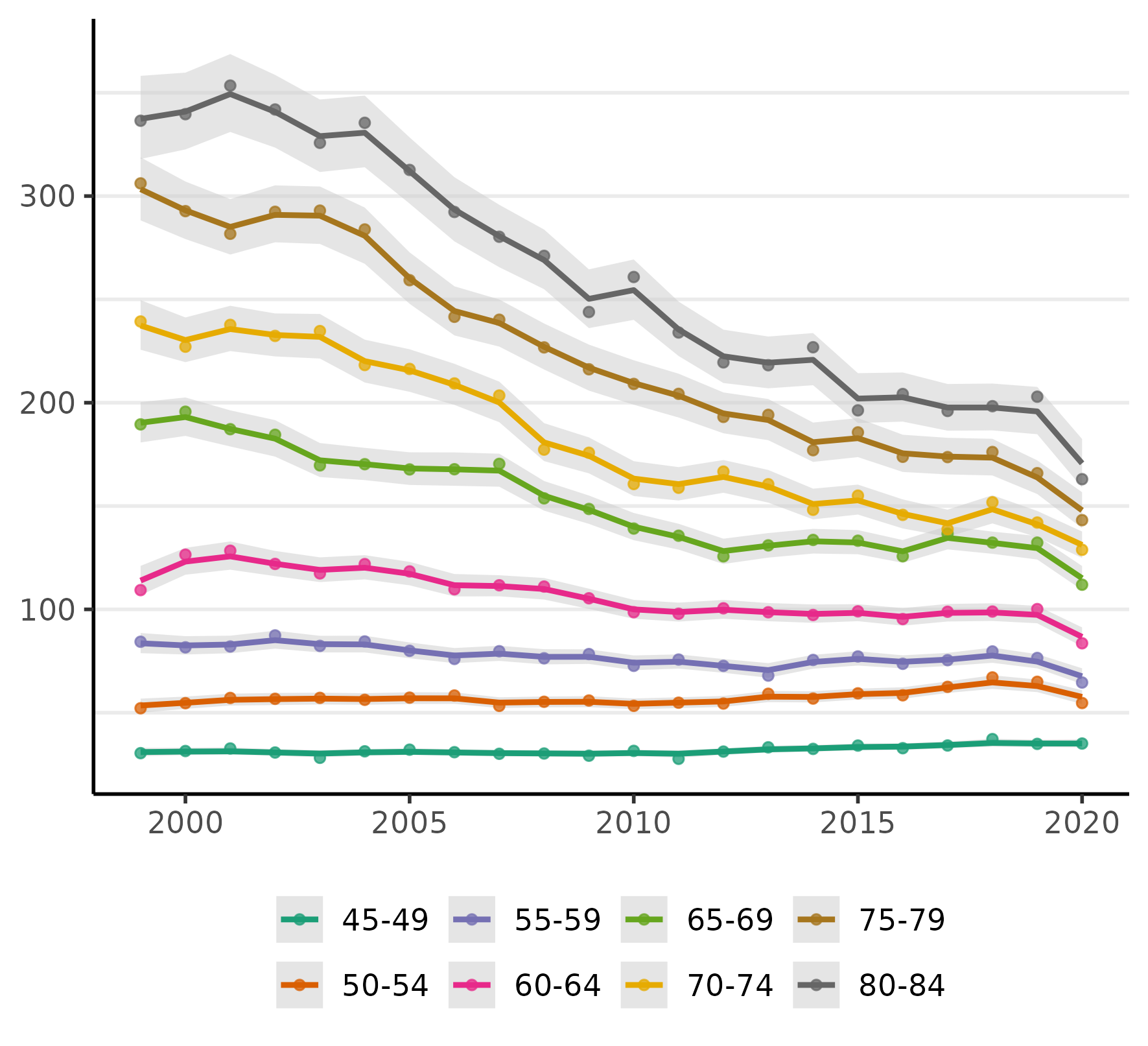
The figure displays the crude rates (as points), an estimate of the time trends (the line), and 95% credible intervals for the trend (the shaded regions).
We can also put each age group in its own plot:
plot(fit, facet = TRUE, facet_scales = 'free', size = 0, scale = 100e3)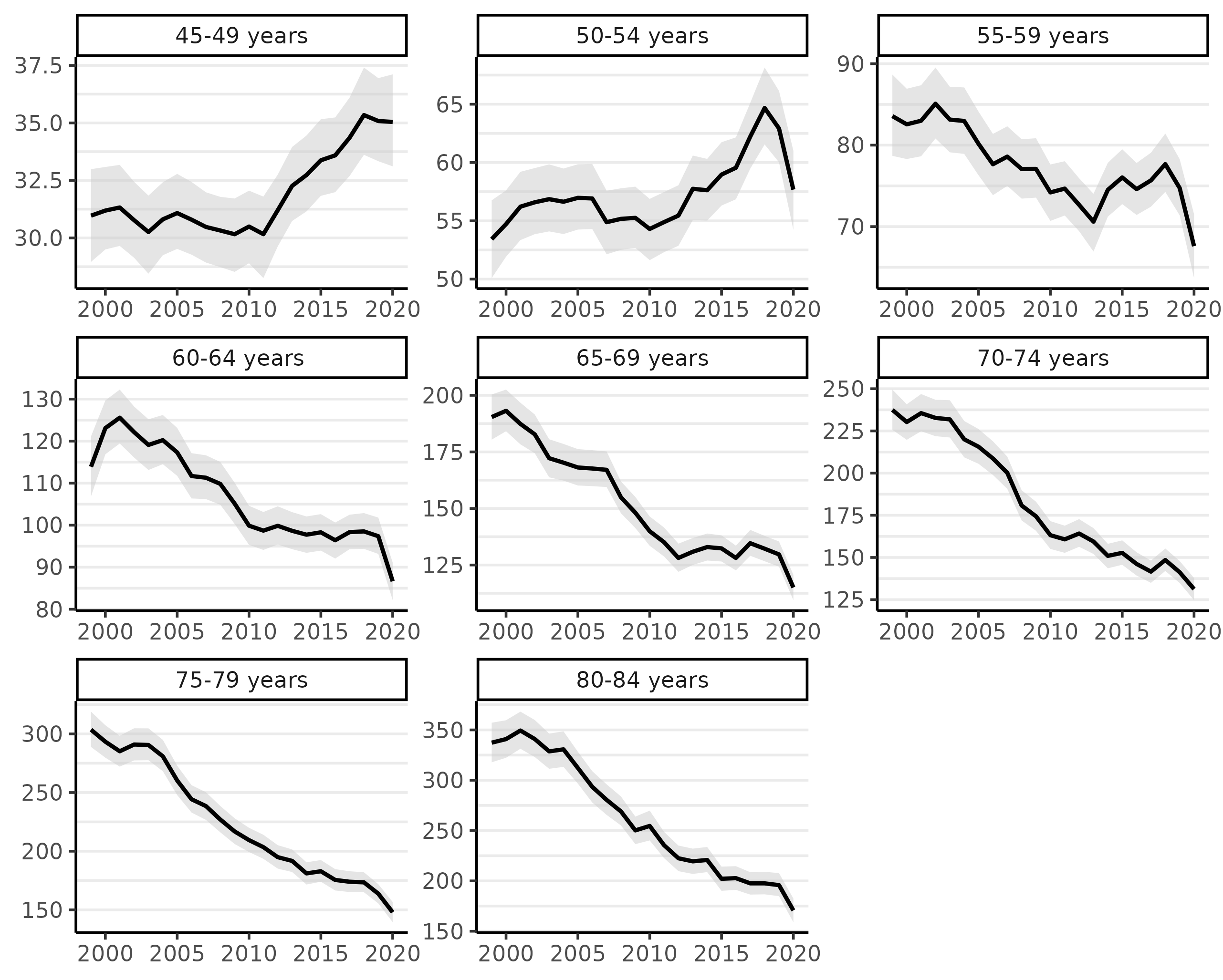
The facet_scale = 'free' allows the y-axis limits to vary across each facet. The size argument controls the size of the points, which represent the crude incidence rates; setting this to 0 removes the points.
Looking at the figure above, we can see there has been a steep decline in CRC incidence among those of screening-age (50-75+) over the past two decades (because screening colonoscopy can prevent CRC by removing potentially pre-cancerous polyps).
Notably, almost all of the decline in CRC incidence in this period was for ages over 60 and especially 64. Even ages 80-84 show a very steep decline, which we might reasonably speculate is a result of (a) people choosing to continue CRC screening past the age of 75 and/or (b) that the preventive benefits of colonoscopy last about a decade (per official screening guidelines). Rates for those under 55 have been rising (a little more will be said about this below).
We can view a summary of results with the print method:
print(fit, scale = 100e3, digits = 3)
Summary of surveil model results
Time periods: 22
Grouping variable: Age.Groups
Correlation matrix: FALSE
    time   Age.Groups  mean lwr_2.5 upr_97.5
1   1999  45-49 years  31.0    29.0     33.0
2   2000  45-49 years  31.2    29.5     33.1
3   2001  45-49 years  31.3    29.7     33.2
4   2002  45-49 years  30.8    29.1     32.4
5   2003  45-49 years  30.3    28.4     31.8
...
Custom plots with base R
The default plots are created using the 'ggplot2' R package. We can use the data stored in fit$summary to create custom plots using whatever method we prefer. Here's an example for plotting a single time trend, for ages 50-54, using base R functions.
# one age group
df <- subset(fit$summary, Age.Groups.Code == '50-54')

# rates per 100,000 at risk
scale <- 100e3
df <- transform(df,
   est = mean * scale,
   lwr = lwr_2.5 * scale,
   upr = upr_97.5 * scale
   )

# plot range
y_range <- c(min(df$lwr), max(df$upr))

# fill color
col <- rgb(0.1, 0.4, 0.6, alpha = .7)

# uncomment to save figure to disk
# png("crc-trend-50-54.png",
# 	width = 6,
# 	height = 5,
# 	units = 'in',
# 	res = 500)


# plot margins
par(mar = c(3, 3, 1, 1))

# plot line
plot(df$time,
     df$est,
     type = 'l', # line
     bty = 'l', # box type
     xaxt = 'n', # add axes below
     yaxt = 'n',
     xlab = NA,
     ylab = NA,
     ylim = y_range)

# add credible interval
polygon(x = c(df$time, rev(df$time)),
        y = c(df$lwr, rev(df$upr)),
	col = col
	)

# add axes
axis(1, lwd = 0, lwd.ticks = .5, padj = -0.5)
axis(2, lwd = 0, lwd.ticks = .5, padj = 0.5)

# axis titles
mtext("Year", side = 1, line = 2)
mtext("Cases per 100,000", side = 2, line = 2)

# uncomment if saving to disk
# dev.off()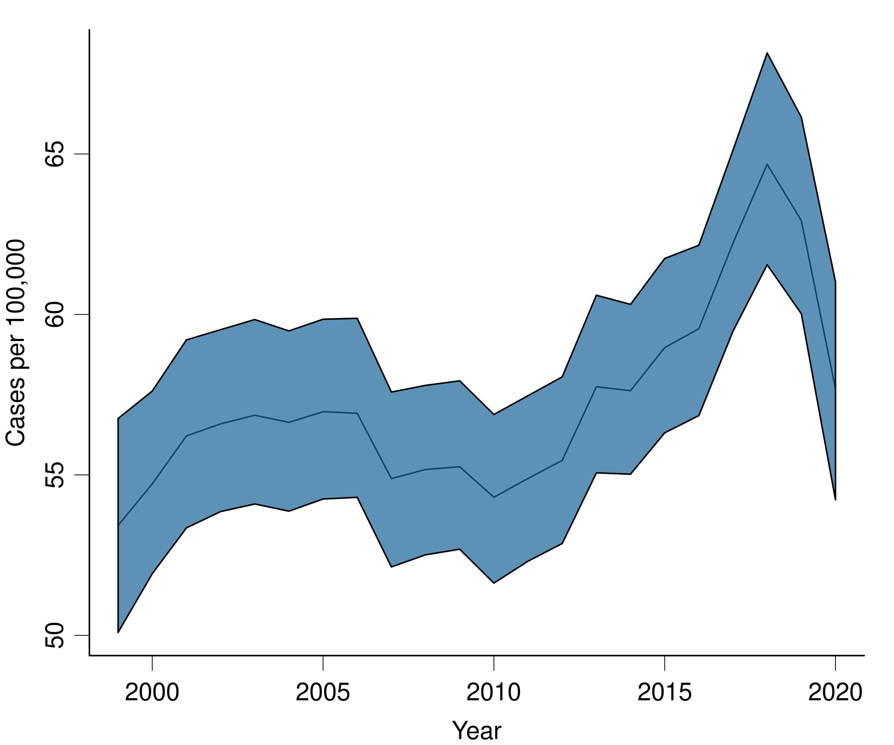
Percent change analysis
We can summarize these age-specific trends by calculating percent change statistics for them. Dividing cumulative percent change by the number of time periods gives the average annual percent change. ('surveil' also returns annual percent change estimates; those are always subject to much more uncertainty than the cumulative change.)
The following two lines of code will use the fitted models to produce cumulative percent change plots for each age group:
fit_pc <- apc(fit)
plot(fit_pc, cumulative = TRUE)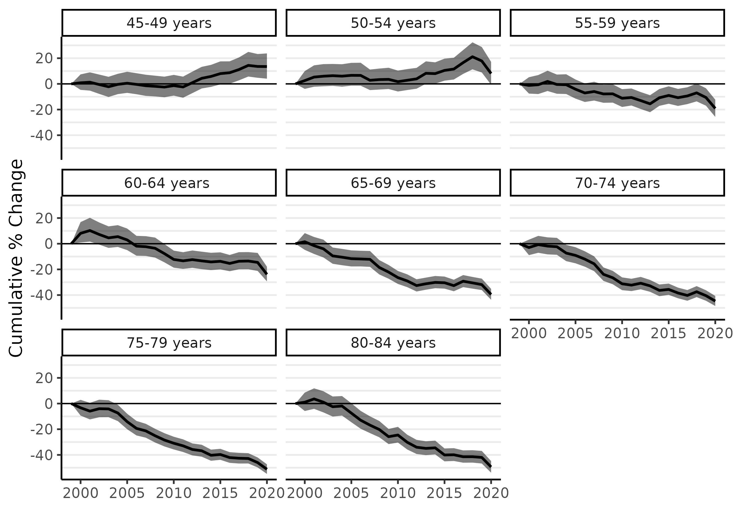
The cumulative percent change estimates are stored in a 'data.frame' called cpc inside the fit_pc object. I'll print the estimates for 2019: these show cumulative percent change from 1999 to 2019. We want to avoid using the 2020 data, because the pandemic delayed a great deal of cancer diagnoses; we can expect these to re-appear in subsequent years, at later stages of progression. (Were this a more serious analysis, I would most certainly drop the 2020 data before modeling.)
subset(fit_pc$cpc, time == 2019) |>
  print(digits = 2, row.names = FALSE)
time group cpc lwr upr 2019 45-49 years 13 4.7 23.1 2019 50-54 years 18 8.8 28.2 2019 55-59 years -10 -16.9 -3.5 2019 60-64 years -14 -20.9 -7.5 2019 65-69 years -32 -36.2 -27.1 2019 70-74 years -40 -44.4 -36.4 2019 75-79 years -46 -49.8 -42.1 2019 80-84 years -42 -46.5 -36.8
From 1999 to 2019, the 45-49 and 50-54 age groups saw CRC incidence increase by 13% and 18%, respectively. The greatest declines occurred for the highest age groups: about 46% for ages 75-79 and 42% for ages 80-84, which is equivalent to an average of just over 2% per year since 1999. (We'll calculate similar statistics for custom date ranges below.)
The trend of rising CRC incidence among younger ages groups is now found internationally, and it is the reason why the recommended age to begin screening has been moved down to 45. However, most research has focused on 'early-onset CRC', meaning (somewhat arbitrarily) 'before age 50'. Unfortunately, that focus is probably too narrow and potentially quite misleading. As some have argued, it is more accurate to describe the problem as 'increasing CRC incidence among those born since 1955' (see Murphy and Zaki 2024 in Nature Reviews Gastroenterology & Hepatology). The sharp rise of incidence among the 50-54 age group ought to be taken as a warning for the near future.
Age standardized rates
An advantage of ‘surveil’ (and Markov chain Monte Carlo analysis generally) is that users can calculate any kind of summary statistic from the model results, and obtain appropriate credible intervals for them. (Appropriate for the model, that is; whether the model is fit to purpose is a separate question.) An important example is age-standardization.
‘surveil’ comes packaged with the 2000 U.S. standard million population, which we can load by entering data(standard). To apply direct age standardization to our model of age-specific rates, we simply pass our model and the standard population data to the standardize function, as follows:
data(standard)
fit_st <- standardize(fit, label = standard$age, standard_pop = standard$standard_pop)
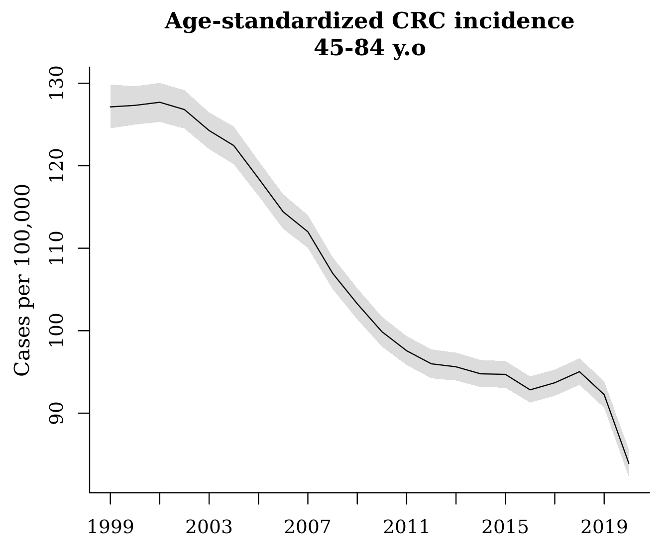
The output, fit_st, can be treated just like the other ‘surveil’ model objects: we can produce a decent plot of age-standardized rates using plot(fit_st, scale = 100e3), or we can use the summary data in the output to create a custom plot. As noted above, the sharp decline in 2020 is almost certainly due only to pandemic restrictions that prevented people from receiving diagnoses.
We can also apply our percent change methods to the age-standardized model, fit_st, and then plot the cumulative percent change in age-standardized rates:
fit_st_pc <- apc(fit_st)
plot(fit_st_pc, cum = TRUE)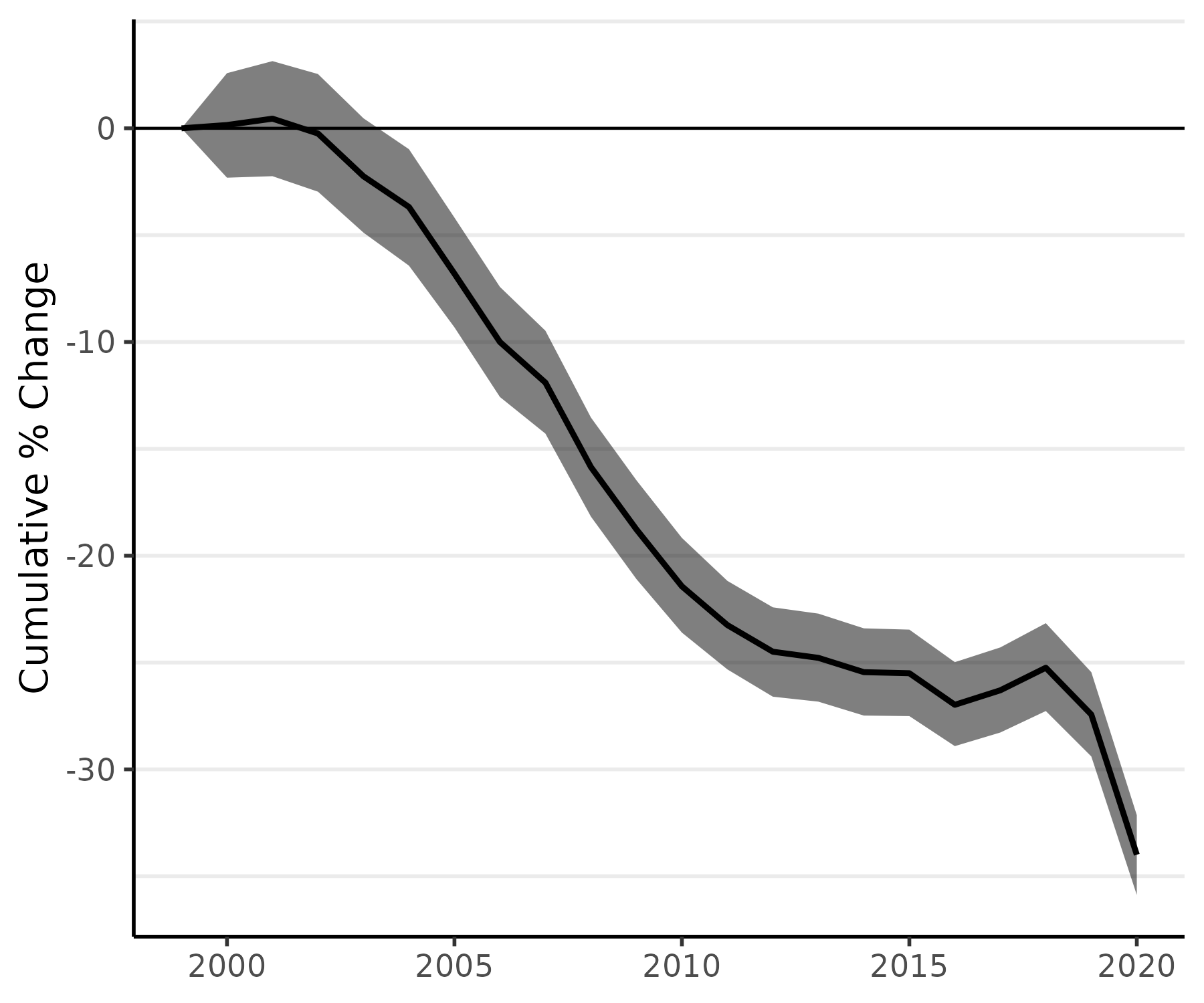
Custom quantities of interest
Age-standardized rates and percent change analyses are examples of inferences about 'quantities of interest', where the quantities that can be derived from the model's estimates. These inferences are made done using standard Markov chain Monte Carlo (MCMC) techniques. For more of MCMC analyiss with 'surviel' - such as how to complete a percent change analysis for a custom date range -you can see this vignette from the package documentation.
Citing ‘surveil’
If you use 'surveil' in your work, please provide a citation. The package was introduced in the following article, which provides the recommended citation:
Donegan, Connor, Amy E Hughes and Simon J Craddock Lee (2022). Colorectal Cancer Incidence, Inequalities, and Prevention Priorities in Urban Texas: Surveillance Study with the 'surveil' software package. JMIR Public Health & Surveillance 8, no. 8: e34589 DOI:10.2196/34589 PMID:35972778
For questions, issues, discussion, etc., visit the github repo at https://github.com/connordonegan/surveil or send me an e-mail.