A minimalist basemap for urban cartography
For a recent project, I a wanted a basemap that would display the local street network with some basic infrastructure and hydrology, but without any labels. It is now easy to add web maps to a GIS project by connecting to OpenStreetMap (OSM), CartoDB, or another web tile server. However, if you want to change the styling or control what type of objects are shown (and at what scales), then a web tile server won’t get you very far.
The closest I’ve seen to the kind of minimalist basemap I’d like to have is CartoDB’s Positron. They provide a version without any labels:
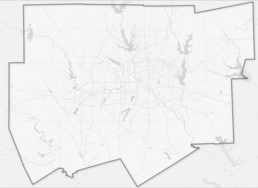
CartoDB's Positron, without labels
The CartoDB option looks pretty bland. I’d like to improve the contrast and to see at least some of the street network at this scale. The basemaps are going to be used in a small set of maps that show some site locations, a population density choropleth, and one or two other choropleths for the Dallas-Fort Worth, Texas area (highlighted in the map above). These are for an old fashioned document, not web mapping.
I’m going to share a few methods I worked through to create a custom basemap - vector tiles, the Overpass API, and Census Bureau files. In the end I primarily used data from the Census Bureau and USGS.
Contents:
OSM vector tiles
Using vector tiles, it is possible to control how the OSM basemap is rendered. The Wandering Cartographer has a nice introduction to vector tiles. When we load a basemap as a regular web tile, we receive images without any ability to adjust the styling. When you load a vector tile, you can control the symbology for every object that is part of the OSM layer.
Adding an OSM vector tile into the open-source QGIS desktop software is straightforward. There are now various ways to access OpenStreetMap vector tiles for free. I’m using Esri’s server for this (there’s no need to create an account with them). To do the same, go to the QGIS Browser panel and find the ‘Vector Tiles’ item; right-click on it and select ‘New ArcGIS Vector Tile Service Connection’. A window will pop-up where you simply provide a couple URLs (given below) and then click ‘OK’.
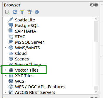
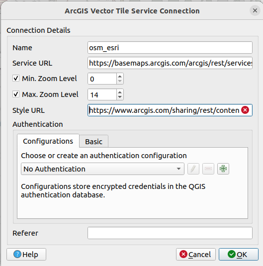
Adding OSM vector tiles to QGIS
Start by giving the layer a name (I chose ‘osm_esri’). For the Service URL, paste in the following:
https://basemaps.arcgis.com/arcgis/rest/services/OpenStreetMap_v2/VectorTileServer
For the Style URL, use this:
https://www.arcgis.com/sharing/rest/content/items/3e1a00aeae81496587988075fe529f71/resources/styles/root.json?f=pjson
After clicking ‘OK’, it the new ‘osm_esri’ layer should be listed under Vector Tiles in the browser. Add it to your map canvass by dragging-and-dropping (or right-click, ‘add layer to project’). At that point, your map canvass should contain an OpenStreetMap basemap. The difference from the usual basemap is that you have detailed control over the symbology. If you double-click on the ‘osm-esri’ layer, as listed in your Layers panel, you can open up the Symbology. You’ll find a long list of items, every one of which has its own styling.
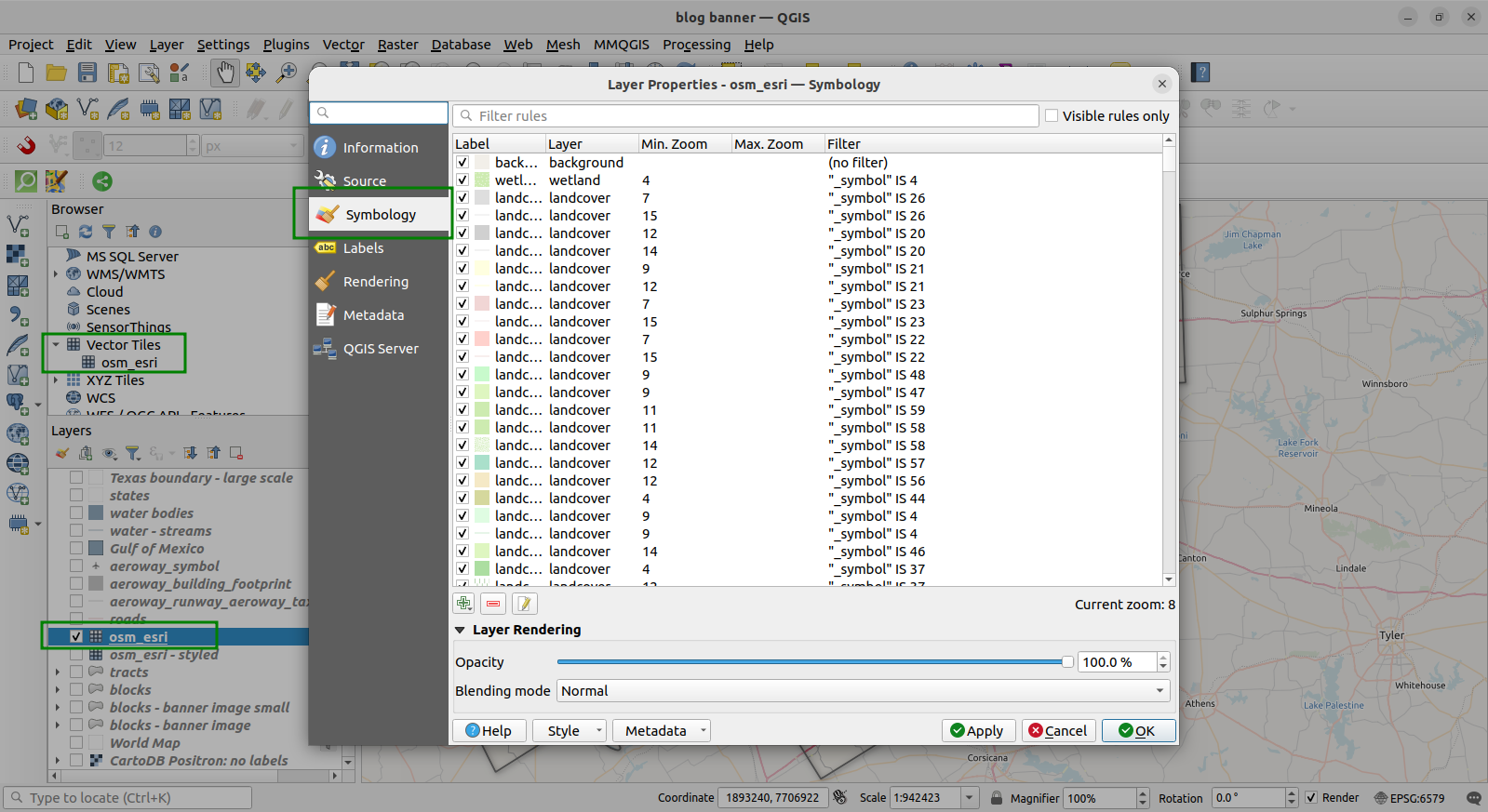
The symbology panel for the OSM vector tiles
The first item is the background; if you un-check the box on the first row, the background will be turned off. If you double click on the first row, you can change the color, opacity, etc., of the background layer. The search bar at the top is very helpful for finding items, as is the ‘visible rules only’ option (this will limit the list to items that are visible at the current zoom level). A search for ‘road’ or ‘water’, while limiting to the ‘visible rules’, will turn up a less intimidating set of features to start editing.
To be more discriminating, you can look at the ‘Min. zoom’ level; objects that are visible at a minimum zoom level of 5 will all have a similar place in the object hierarchy (similar size or prominence). They will generally appear larger or more prominent than objects with a higher minimum zoom (say, min. zoom level of 12). I worked on setting all the level 5 roads, checked results, then moved on to others. I treated levels 7, 8, and 9 all as one.
If you switch from Symbology to Labels in the same Layer Properties window (shown above), you can turn off all the labels at once by selecting ‘No labels’.
The downside to using vector tiles should be clear already - there are a lot of rules to adjust here. To avoid repeating this process every time you want to adjust the settings, use QGIS ‘project colors’ and ‘project variables’ (the Wandering Cartographer posts linked to above also covers this, as does the QGIS documentation). I wanted to adjust the width of the lines used to symbolize the roads - highways should be thicker (or maybe just darker) than side streets. I knew that different road types would need a different width (and/or color), so I stored two project variables: one named ‘lwd_roads5’ and another named ‘lwd_roads7’. The numbers 5 and 7 are just a way for me to distinguish between ‘larger’ and ‘smaller’ roads; the choice of numbers was based on their (default) minimum zoom levels.
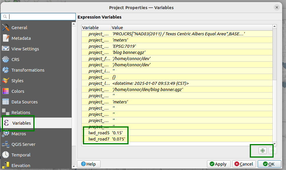
Custom project variables (from the Project Properties window)
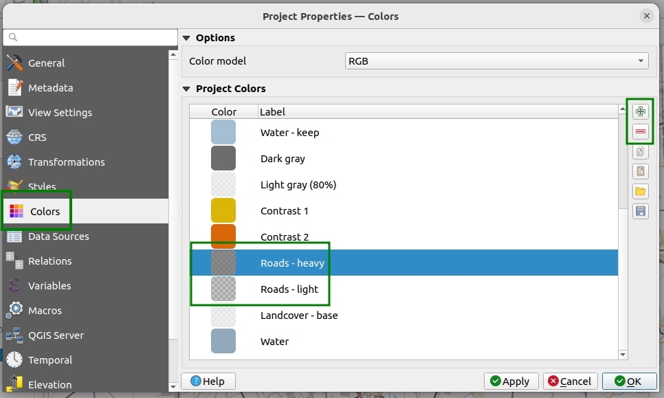
Custom project colors (from the Project Properties window)
Given you’ve saved some project variables and project colors, you can go about using them to adjust the OSM symbology. In the symbology, I started by filtering for ‘roads’, then looked for the layers with minimum zoom level of 5. I went through each and set them to same dark gray (which I named ‘Roads - heavy’). I then went through roads with zoom level of 7, 8, and 9 and gave each of them the same color (my ‘Roads - light’ variable). Then I searched for ‘water’ and changed the color, using a project color again.
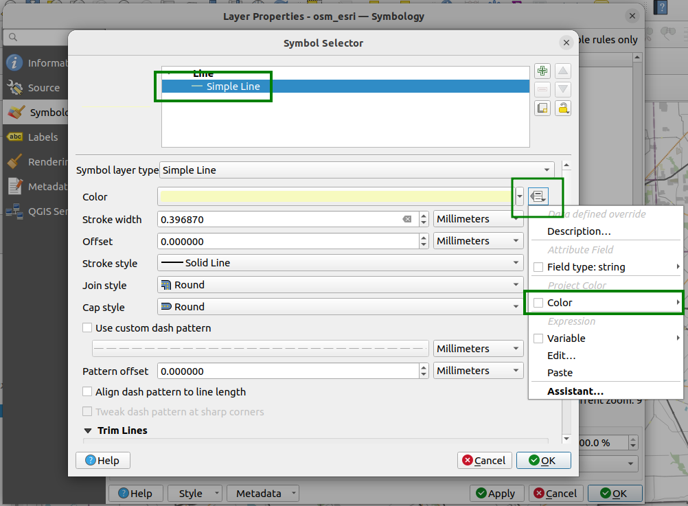
Setting symbology to a 'project color'
After you set the symbology for some layers using Project Colors and Variables, you can change with the colors (and line widths) all at once. Just change your stored Project Colors and Project Variables. With a little effort you can create some impressive results this way (see Wandering Cartographer again for styling with works of art).
You can also adjust the minimum zoom level for each OSM vector layer - supposedly. I was able to change the values for the minimum zoom level in the symbology, but the map didn’t render differently. Maybe I’m just missing some information here, but for my purposes its becoming a bit of a hassle. The map is not bad at this point, but I’d like a bit more detail than this.
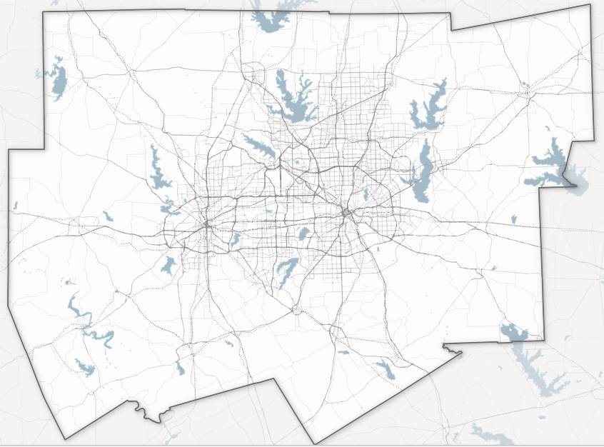
OSM vector tiles with custom styling
The QuickOSM plugin is another way to pull OSM data (it builds queries and sends them to the Overpass API). I used it to get layers for airports (‘aeroways’). The DFW airport has a footprint the size of a medium sized city, so its nice to have this even on a smaller scale map of the region.
U.S. Census Bureau products
The Census Bureau maintains detailed spatial data on road networks, including local roads, and also provides nice hydrology layers (streams and water bodies). These can be fairly large files. If the map area were a single county, the process would be fairly simple. For multiple counties we want to use some programming. If you can use R or Python, then I recommend getting these layers from the ‘tigris’ (or ‘pygris’) package.
I start with a list of counties (these happen to form the catchment area for a cancer center). I provide ‘tigris’ with the state FIPS code (48 for Texas) and county names to get the data, using the area_water function to get water bodies, linear_water for streams, and roads for the road network. Using the ‘sf’ package, I save each of the outputs as layers in a GeoPackage named 'minimal_layers.gpkg'. (Not shown below is that I expanded the set of counties to include those surrounding my area of interest, using sf::st_touches to identify the extra counties.)
library(tigris)
library(sf)

GeoPkg <- "minimal_layers.gpkg"

# Texas-Centric Albers Equal Area coordinate ref system
TX_CRS <- 6579

# nb: 'Collin' requires the 'County' suffix to distinguish it from Collingsworth County
county_names <- c("Collin County", "Dallas", "Denton", "Ellis", "Hunt",
                  "Kaufman", "Rockwall", "Johnson", "Parker", "Tarrant",
		  "Wise", "Hood", "Somervell")

# Download water bodies
wbody <- area_water(state = 48, county = county_names)

# use appropriate CRS
wbody <- st_transform(wbody, crs = TX_CRS)

# remove little ponds, etc.
wbody <- subset(wbody, AWATER > 800000)

# save to a GeoPackage
st_write(wbody, GeoPkg, 'water bodies')

# Repeat for rivers
wlines <- linear_water(state = 48, county = county_names)
wlines <- subset(wlines,
       !grepl('Crk$|Ditch$|Br$|Pond', FULLNAME) &
       !is.na(FULLNAME)
       )
wlines <- st_transform(wlines, crs = TX_CRS)
st_write(wlines, GeoPkg, 'water - streams')

# and for roads
roads <- roads(state = 48, county = county_names)
roads <- st_transform(roads, crs = TX_CRS)
roads <- subset(roads, !is.na("RTTYP"))
st_write(roads, GeoPkg, 'roads')
The water layers needed to be trimmed down first. The water bodies layer contains all sorts of tiny ponds, especially in agricultural areas. When mapping all of them, it looks like someone speckled paint over the canvass. I already have an idea of which bodies of water are substantial enough to include for my purposes, and I can find their area (in square meters) in the AWATER field, which is a standard field in Census Bureau layers. After some trial and error (you obviously want to employ your own criteria here), I subset the water bodies to include only those with area greater than 0.8 km^2; likewise, I remove the creeks, ditches, ponds, and unnamed hydrology from the linear water layer.
As before, I want to style the roads differently based on their type: large arterials should be more prominent than local streets. I use the same Project Colors and Project Variables as before to set the colors and line widths. You could split the roads layer into two based on some criteria, but its much easier to use a conditional expression to set the style.
Road type is stored in a field called “RTTYP”, where entries of “I” and “US” indicated interstate/U.S. highways. For highways, I’ll use the heavy color and slightly thicker line width.
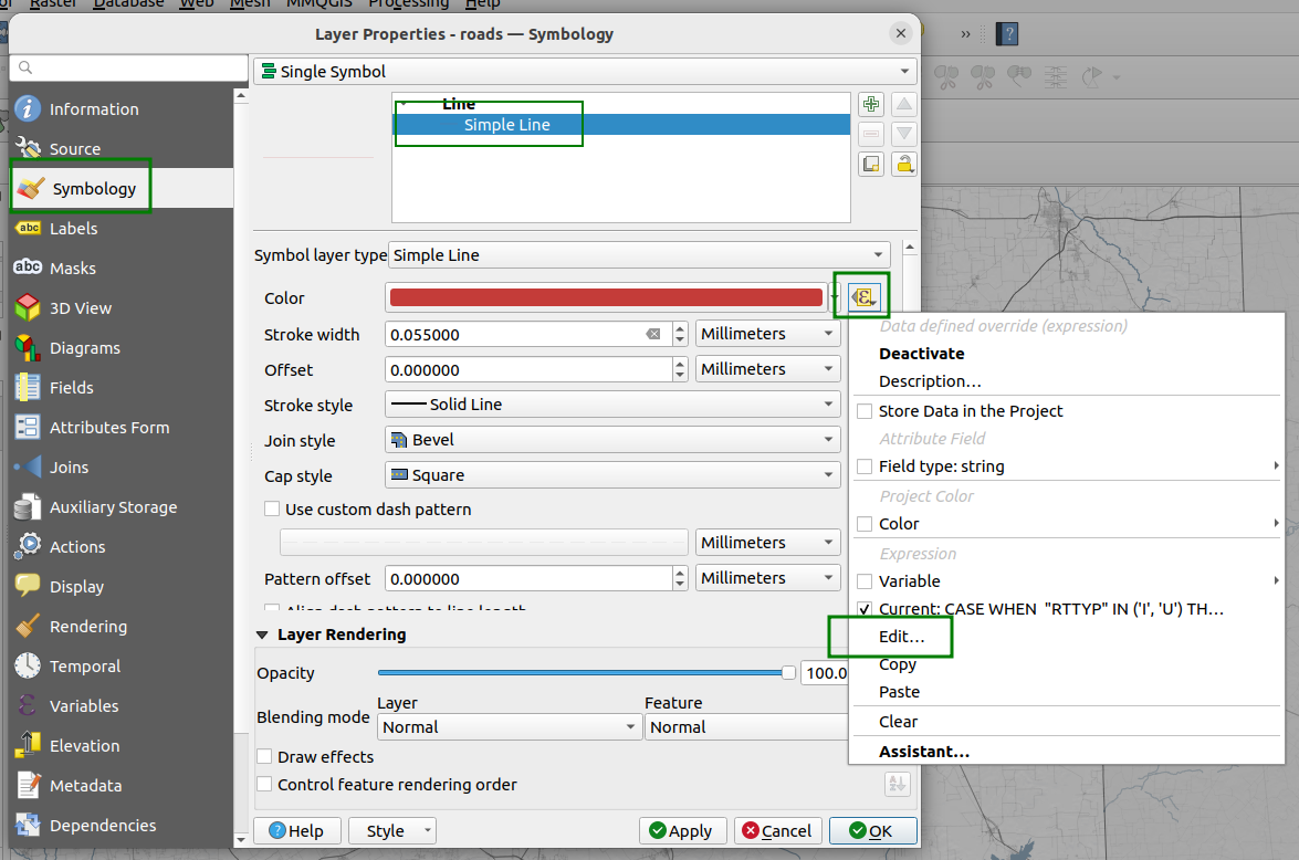
Opening the expression builder for the road symbology
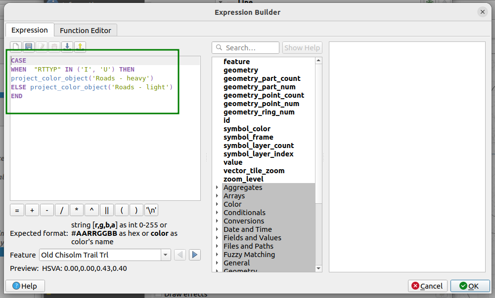
Using the expression builder
The text of the expression shown is:
CASE
WHEN  "RTTYP" IN ('I', 'U') THEN project_color_object('Roads - heavy')
ELSE project_color_object('Roads - light')
END
The Project Colors are invoked like stored variables using project_color_object. The expression for the line width is similar:
CASE
WHEN  "RTTYP" IN ('I', 'U') THEN  @lwd_road5
ELSE  @lwd_road7
END
USGS
The final touch will be a shaded relief map from USGS. You can get this as a Web Map Service (WMS). The process is similar to getting vector tiles: in the QGIS browser panel, find the WMS/WMTS item. Right-click on it and select ‘New Connection’. You can name it whatever you like (e.g., ‘USGS’), and use the following URL:
https://basemap.nationalmap.gov/arcgis/rest/services/USGSShadedReliefOnly/MapServer/WMTS/1.0.0/WMTSCapabilities.xml
The shaded relief layer adds some subtle dimensionality to the basemap. This can help even in a place as topographically boring as Dallas-Fort Worth, although the effects dependent on your map scale.
Our minimalist basemap
Compared to the generic basemap we started with, this one has more detail at smaller map scales, while stil being minimalist. Applying a blending mode to the layers is one firther step to help them stand out.
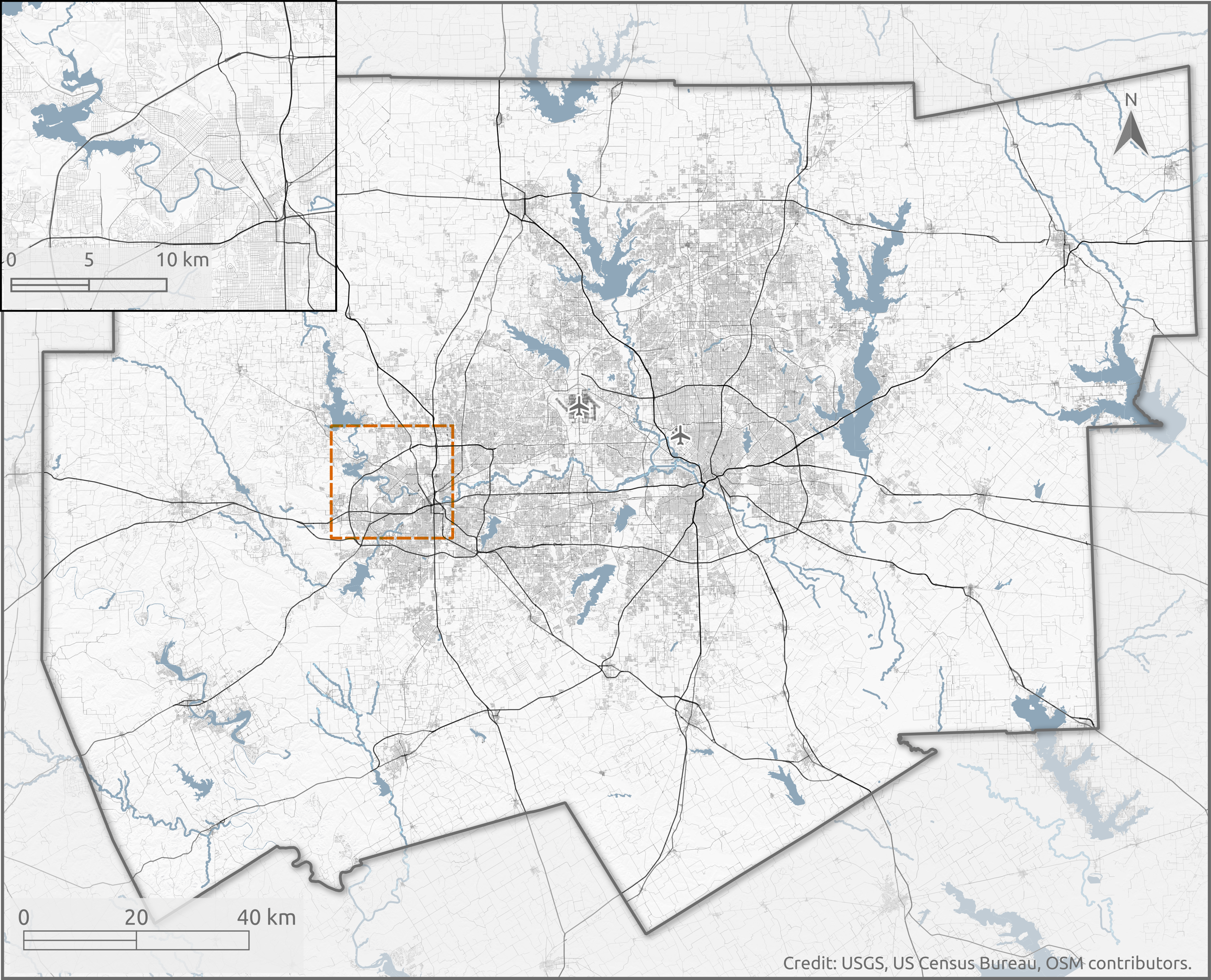
A minimalist basemap
Below is how it looks with a population density layer. If you remove or hide all census blocks with zero population, prominent features in the base layer appear nicely.
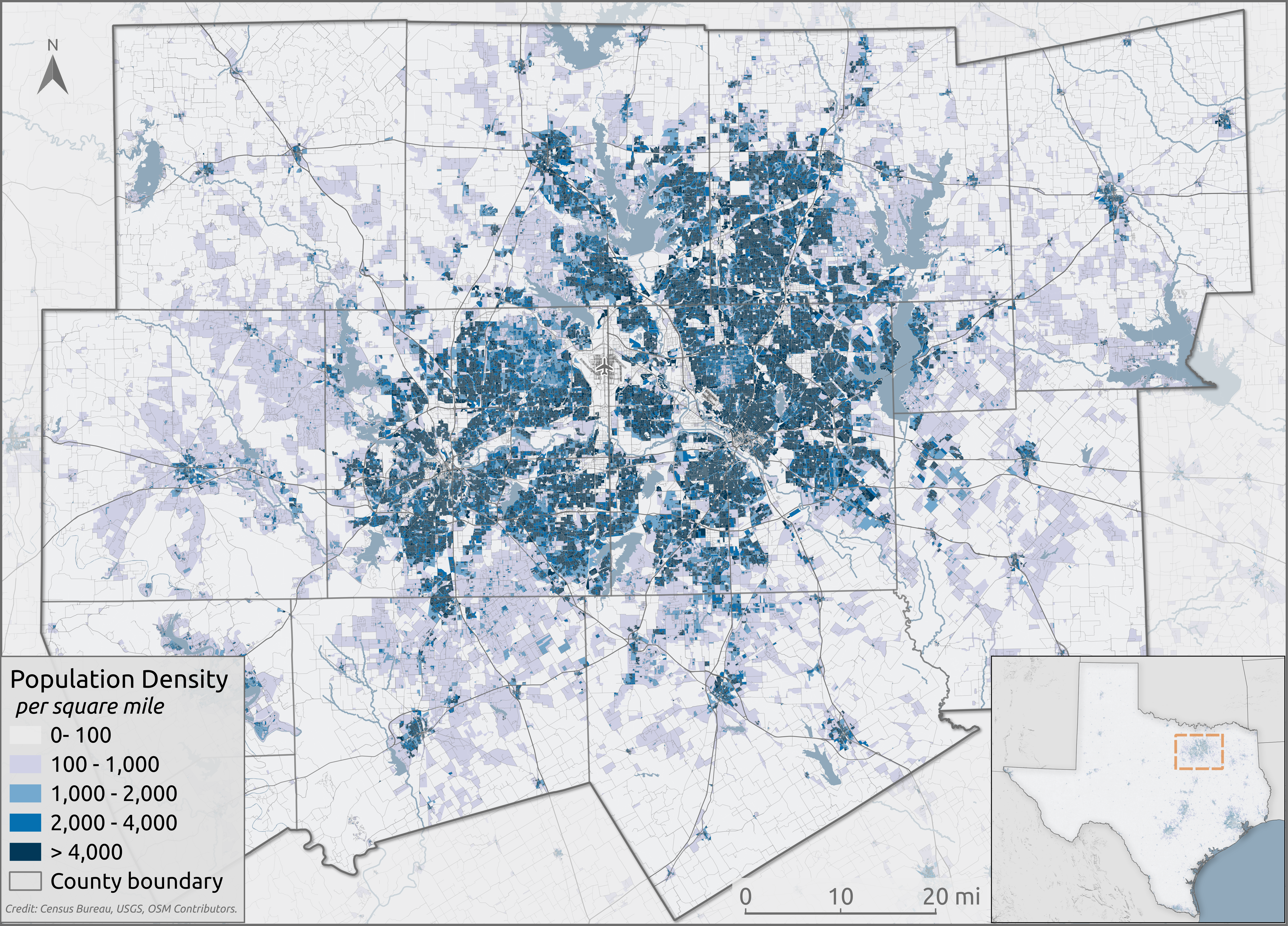
Population density map for the Dallas-Fort Worth metropolitan area