This vignette demonstrates basic usage of surveil for public health surveillance. surveil leverages the principles of Bayesian inference and Markov chain Monte Carlo (MCMC) (Jaynes 2003; MacKay 2003) to infer population risk of disease or death given time series data consisting of case counts and population at risk. Models were built using the Stan modeling language, but users only need to be familiar with the R language.
The package also contains special methods for age-standardization, printing and plotting model results, and for measuring and visualizing health inequalities. For age-standardization see vignette("age-standardization").
Getting started
The models will run much fast using parallel processing, which will automotically happen if you set the following option:
 # here the code is displayed only, not run; for package development reasons
options(mc.cores = parallel::detectCores())
Surveillance data minimally contain case counts, reliable population at risk estimates, and a discrete time period variable. They also may include one or more grouping variables, such as race-ethnicity.Time periods should consist of equally spaced intervals.
This vignette analyzes age-specific (ages 50-79) colorectal cancer incidence data by race-ethnicity, year, and Texas MSA, obtained through CDC Wonder. The race-ethnicity grouping includes (non-Hispanic) Black, (non-Hispanic) White, and Hispanic, and the MSAs include those centered on the cities of Austin, Dallas, Houston, and San Antonio.
head(msa) %>%
  kable(booktabs = TRUE,
caption = "Glimpse of colorectal cancer incidence data (CDC Wonder)") | Year | Race | MSA | Count | Population |
|---|---|---|---|---|
| 1999 | Black or African American | Austin-Round Rock, TX | 28 | 14421 |
| 2000 | Black or African American | Austin-Round Rock, TX | 16 | 15215 |
| 2001 | Black or African American | Austin-Round Rock, TX | 22 | 16000 |
| 2002 | Black or African American | Austin-Round Rock, TX | 24 | 16694 |
| 2003 | Black or African American | Austin-Round Rock, TX | 34 | 17513 |
| 2004 | Black or African American | Austin-Round Rock, TX | 26 | 18429 |
surveil’s model fitting function, stan_rw, requires that the user provide a data.frame with specific column names. There must be one column named Count containing case counts, and another column named Population, containing the sizes of the populations at risk. The user also must provide the name of the column containing the time period, and, optionally, a grouping factor. For the MSA data printed above, the grouping column is Race and the time column is Year.
Preparing the data
We will demonstrate using aggregated CRC cases across Texas’s top four MSAs. The msa data from CDC Wonder already has the necessary format (column names and contents), but these data are dis-aggregated by MSA. So for this analysis, we first group the data by year and race, and then combine cases across MSAs.
The following code chunk aggregates the data using the dplyr package:
tx.msa <- msa %>%
  group_by(Year, Race) %>%
  summarise(Count = sum(Count),
            Population = sum(Population))
The following code provides a glimpse of the aggregated data (Table 2):
head(tx.msa) %>%
  kable(booktabs = TRUE,
caption = "Glimpse of aggregated Texas metropolitan CRC cases, by race and year")| Year | Race | Count | Population |
|---|---|---|---|
| 1999 | Black or African American | 471 | 270430 |
| 1999 | Hispanic | 361 | 377471 |
| 1999 | White | 2231 | 1654251 |
| 2000 | Black or African American | 455 | 283280 |
| 2000 | Hispanic | 460 | 405562 |
| 2000 | White | 2343 | 1704425 |
Model specification
The basics
The base surveil model is specified as follows. The Poisson model is used as the likelihood: the probability of observing a given number of cases, \(y_t\), conditional on a given level of risk, \(e^{\phi_t}\), and known population at risk, \(p_t\), is: \[y_t \sim \text{Pois}(p_t \cdot e^{\phi_t})\] where \(t\) indexes the time period.
Alternatively, the binomial model is available: \[y_t \sim \text{Binom}(p_t \cdot g^{-1}(\phi_t))\] where \(g\) is the logit function and \(g^{-1}(x) = \frac{exp(x)}{1 + exp(x)}\) (the inverse-logit function). The Poisson model is often preferred for ‘rare’ events (such as rates below .01), otherwise the binomial model is generally more appropriate. The remainder of this vignette will proceed using the Poisson model only.
Next, we build a model for the log-rates, \({\phi_t}\) (for the binomial model, the rates are logit-transformed, rather than log-transformed). The first-difference prior states that our expectation for the log-rate at any time is its previous value, and we assign a Gaussian probability distribution to deviations from the previous value (Clayton 1996). This is also known as the random-walk prior: \[\phi_t \sim \text{Gau}(\phi_{t-1}, \tau^2)\] This places higher probability on a smooth trend through time, specifically implying that underlying disease risk tends to have less variation than crude incidence.
The log-risk for time \(t=1\) has no previous value to anchor its expectation; thus, we assign a prior probability distribution directly to \(\phi_1\). For this prior, surveil uses a Gaussian distribution. The scale parameter, \(\tau\), also requires a prior distribution, and again surveil uses a Gaussian model.
Multiple time series
For multiple time series, surveil allows users to add a correlation structure to the model. This allows our inferences about each population to be mutually informed by inferences about all other observed populations.
The log-rates for \(k\) populations, \(\boldsymbol \phi_t\), are assigned a multivariate Gaussian model (Brandt and Williams 2007): \[\boldsymbol \phi_t \sim \text{Gau}(\boldsymbol \phi_{t-1}, \boldsymbol \Sigma),\] where \(\boldsymbol \Sigma\) is a \(k \times k\) covariance matrix.
The covariance matrix can be decomposed into a diagonal matrix containing scale parameters for each variable, \(\boldsymbol \Delta = diag(\tau_1,\dots \tau_k)\), and a symmetric correlation matrix, \(\boldsymbol \Omega\) (Stan Development Team 2021): \[\boldsymbol \Sigma = \boldsymbol \Delta \boldsymbol \Omega \boldsymbol \Delta\] When the correlation structure is added to the model, then a prior distribution is also required for the correlation matrix. surveil uses the LKJ model, which has a single shape parameter, \(\eta\) (Stan Development Team 2021). If \(\eta=1\), the LKJ model will place uniform prior probability on any \(k \times k\) correlation matrix; as \(\eta\) increases from one, it expresses ever greater skepticism towards large correlations. When \(\eta <1\), the LKJ model becomes ‘concave’—expressing skepticism towards correlations of zero.
Fitting the model
The time series model is fit by passing surveillance data to the stan_rw function. Here, Year and Race indicate the appropriate time and grouping columns in the tx.msa data frame.
fit <- stan_rw(tx.msa,
               time = Year,
           group = Race,
           iter = 1500,
           chains = 2  #, for speed only; use default chains=4
           # cores = 4 # for multi-core processing
               )
#> Distribution: normal
#> Distribution: normal
#> [1] "Setting normal prior(s) for eta_1: "
#>  location scale
#>        -6     5
#> [1] "\nSetting half-normal prior for sigma: "
#>  location scale
#>         0     1
#>
#> SAMPLING FOR MODEL 'RW' NOW (CHAIN 1).
#> Chain 1:
#> Chain 1: Gradient evaluation took 1.9e-05 seconds
#> Chain 1: 1000 transitions using 10 leapfrog steps per transition would take 0.19 seconds.
#> Chain 1: Adjust your expectations accordingly!
#> Chain 1:
#> Chain 1:
#> Chain 1: Iteration:    1 / 1500 [  0%]  (Warmup)
#> Chain 1: Iteration:  751 / 1500 [ 50%]  (Sampling)
#> Chain 1: Iteration: 1500 / 1500 [100%]  (Sampling)
#> Chain 1:
#> Chain 1:  Elapsed Time: 0.362141 seconds (Warm-up)
#> Chain 1:                0.228272 seconds (Sampling)
#> Chain 1:                0.590413 seconds (Total)
#> Chain 1:
#>
#> SAMPLING FOR MODEL 'RW' NOW (CHAIN 2).
#> Chain 2:
#> Chain 2: Gradient evaluation took 1.3e-05 seconds
#> Chain 2: 1000 transitions using 10 leapfrog steps per transition would take 0.13 seconds.
#> Chain 2: Adjust your expectations accordingly!
#> Chain 2:
#> Chain 2:
#> Chain 2: Iteration:    1 / 1500 [  0%]  (Warmup)
#> Chain 2: Iteration:  751 / 1500 [ 50%]  (Sampling)
#> Chain 2: Iteration: 1500 / 1500 [100%]  (Sampling)
#> Chain 2:
#> Chain 2:  Elapsed Time: 0.305162 seconds (Warm-up)
#> Chain 2:                0.230082 seconds (Sampling)
#> Chain 2:                0.535244 seconds (Total)
#> Chain 2:
If we wanted to add a correlation structure to the model, we would add cor = TRUE (as opposed to the default, cor = FALSE). To speed things up, we could take advantage of parallel processing using the cores argument (e.g., add cores = 4) to run on 4 cores simultaneously. For age-standardization, see vignette("age-standardization").
MCMC diagnostics
Before analyzing results, it is important to check MCMC diagnostics. Below, three diagnostics are discussed, each with its own purpose. Note that Stan will automatically print a warning to the R console when these diagnostics indicate trouble.
MCMC algorithms, such as the Hamiltonian Monte Carlo algorithm that Stan uses, aim to draw samples from the probability distribution specified by the user. The algorithm tries to explore the probability distribution extensively, and when successful, the resulting samples provide an approximate image of the target probability distribution.
In what follows, we will use the stanfit object stored in our model:
samples <- fit$samples
class(samples)
#> [1] "stanfit"
#> attr(,"package")
#> [1] "rstan"
With samples, we can take advantage of the tools provided by rstan and other packages, such as bayesplot and tidybayes.
Printing samples to the console (print(samples)) is generally an effective way to view the effective sample size, Monte Carlo standard error, and Rhat statistics for each model parameter, in addition to a summary of their marginal posterior distributions.
Monte Carlo standard errors
An important difference between sampling with an MCMC algorithm and sampling from a pseudo random number generator (like rnorm) is that MCMC produces samples that are correlated with each other. This means that for any number of MCMC samples, there is less information than would be provided by the same number of independently drawn samples. To evaluate how far the mean of our MCMC samples may be from the mean of the target probability distribution, we need to consider Monte Carlo standard errors (MCSEs) for each parameter.
MCSEs are calculated as (Gelman et al. 2014)
\[MCSE(\theta) = \frac{\sqrt(Var(\theta))}{\sqrt(ESS(\theta))}\]
where \(Var(\theta)\) is the variance of the posterior distribution for parameter \(\theta\) and ESS is the effective sample size. ESS is adjusted for autocorrelation in the MCMC samples.
To view a histogram of MCSEs for all parameters in the surveil model, we can use rstan’s stan_mcse function:
rstan::stan_mcse(samples)
#> `stat_bin()` using `bins = 30`. Pick better value with `binwidth`.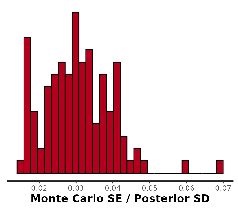
Notice that instead of returning the MCSEs themselves, rstan divides the MCSEs by the scale of the probability distribution, \(\frac{MCSE(\theta)}{SD(\theta)}\). We can see that these values are all under 0.03, which is quite sufficient. We can always obtain smaller MCSEs by drawing a larger number of samples. For a more detailed view, you can start by printing results with print(samples) to examine the n_eff (ESS) column.
R-hat
A second important difference between sampling with MCMC and sampling with functions like rnorm is that with MCMC we have to find the target distribution. The reason rstan (and surveil) samples from multiple, independent MCMC chains by default is that this allows us to check that they have all converged on the same distribution. If one or more chains does not resemble the others, then there is obviously a convergence failure. To make the most of the information provided by these MCMC chains, we can split each of them in half, effectively doubling the number of chains, before checking convergence. This is known as the split Rhat statistic (Gelman et al. 2014). When chains have converged, the Rhat statistics will all equal 1.
Since we always have at least as many parameters as we do time periods, it helps to visualize them all at once using rstan::stan_rhat:
rstan::stan_rhat(samples)
#> `stat_bin()` using `bins = 30`. Pick better value with `binwidth`.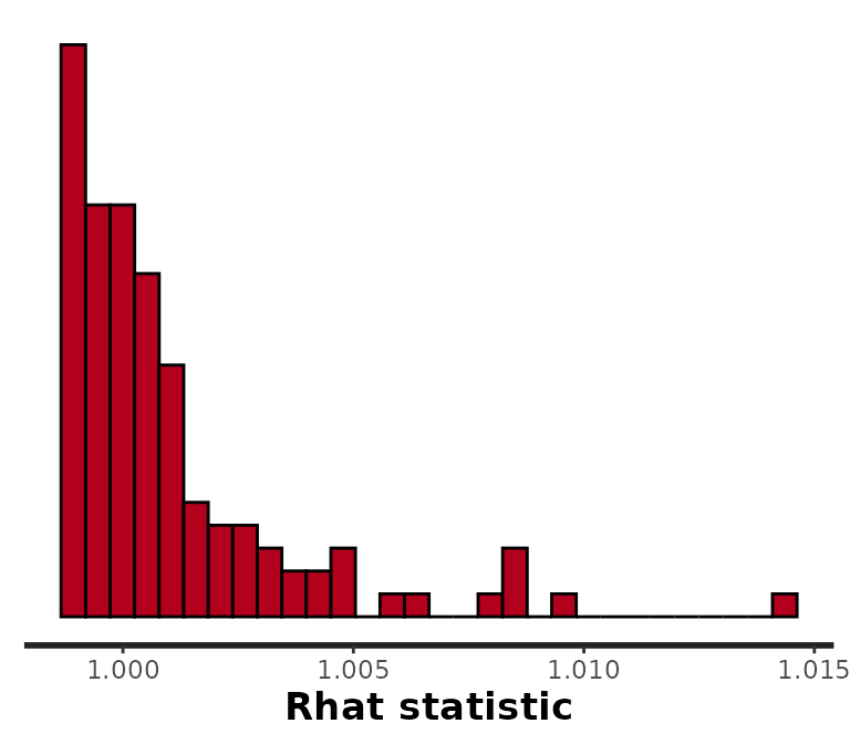
These are all very near to 1. If any were approaching 1.05 or larger, we would want to run the chains for longer and then check results again.
Divergent transitions
Sometimes, MCMC algorithms are unable to provide unbiased samples that will converge on the target distribution given sufficient time. Stan’s MCMC algorithm will issue a warning when it encounters a region of the probability model that it is unable to explore. These warnings of “divergent transitions” should not be ignored, as they indicate that something may have gone wrong (Betancourt 2017b, 2017a). They will be printed to the console just after the model finishes sampling. Note that other MCMC platforms are simply unable to identify this bias (they will not issue a warning like Stan’s divergent transitions).
For the simple models provided by surveil, there will often be a way to address divergent transitions. If you receive a divergent transition warning from a surveil model, these are the three most probable solutions:
- Draw more samples: if you also have low ESS, the divergent transitions may disappear by increasing the number of iterations (lengthening Stan’s adaptation or warm-up period). This is controlled by the
iterargument ofstan_rw; e.g.,stan_rw(data, time = Year, iter = 3e3). However, the default value ofiter = 3000should generally be more than sufficient. - Raise
adapt_delta: you can also control an important tuning parameter related to divergent transitions. Simply raising theadapt_deltavalue to, say, 0.99 or so, may be sufficient; e.g.,stan_rw(data, time = Year, control = list(adapt_delta = 0.99, max_treedepth = 13)). (When raisingadapt_delta, raisingmax_treedepthmay improve sampling speed.) Raisingadapt_deltaever closer to 1 (e.g., to .9999) is generally not helpful. - Check your prior distributions: If your prior information is in strong conflict with the data, this can create a difficult probability distribution to sample from. The most probable cause for such a situation is that you have made a mistake when specifying your (custom) prior distribution. Look first to the prior for \(\eta_1\), the prior for the first log-rate or, for the binomial model, log-odds. You may find that increasing the scale parameter for the
surveil::normalprior distribution on \(\eta_1\) (making the prior more diffuse) causes the divergent transition warnings to disappear.
Despite your best efforts, there may be times when you are not able to prevent divergent transitions. This may occur when the population at risk is small and observations are particularly noisy; introducing the covariance structure (using core = TRUE) may make these issues more difficult to address. If the number of divergent transitions is very low (e.g., a handful out of 4,000 samples), you may determine that the amount of bias introduced appears acceptable for your purposes and report the issue along with results. For obtaining the joint posterior probability distribution of these models, there is no alternative to MCMC.
Visualizing results
If we call plot on a surveil model, we get a ggplot object depicting risk estimates with 95% credible intervals:
plot(fit, scale = 100e3, base_size = 11)
#> Plotted rates are per 100,000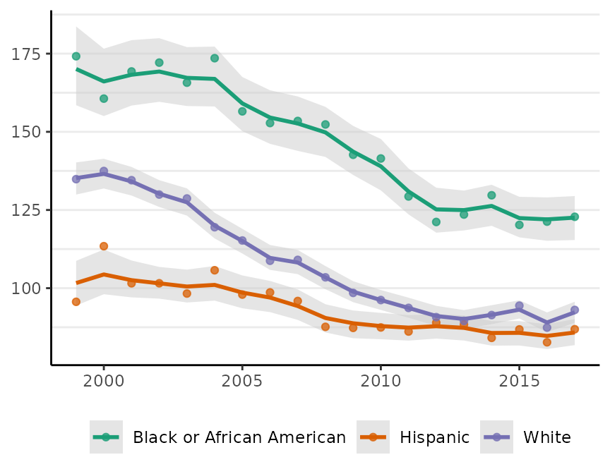 Crude incidence rates are also plotted as points.
The plot method has a number of options to control its appearance. For example, the base_size argument controls the size of labels. The size of the points for the crude rates can be adjusted using size, and size = 0 removes them altogether. We can also use ggplot to add custom modifications:
fig <- plot(fit, scale = 100e3, base_size = 11, size = 0)
#> Plotted rates are per 100,000
fig +
  theme(legend.position = "right") +
  labs(title = "CRC incidence per 100,000",
       subtitle = "Texas MSAs, 50-79 y.o.")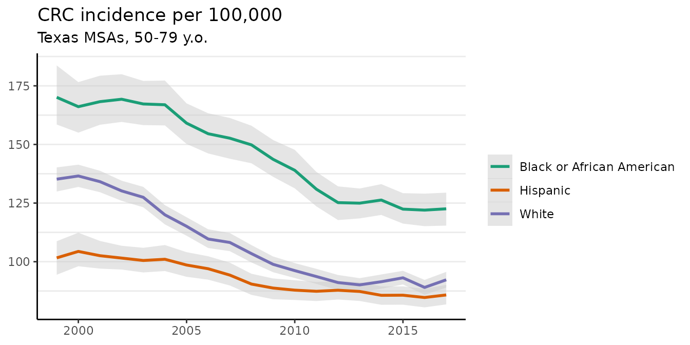
The plot method has a style argument that controls how the probability distribution is represented. The default, style = "mean_qi", shows the mean of the posterior distribution of the risk at each time period with a shaded 95% credible interval (as above). The alternative, style = "lines", plots MCMC samples from the joint probability distribution across all time periods:
plot(fit, scale = 100e3, base_size = 11, style = "lines")
#> Plotted rates are per 100,000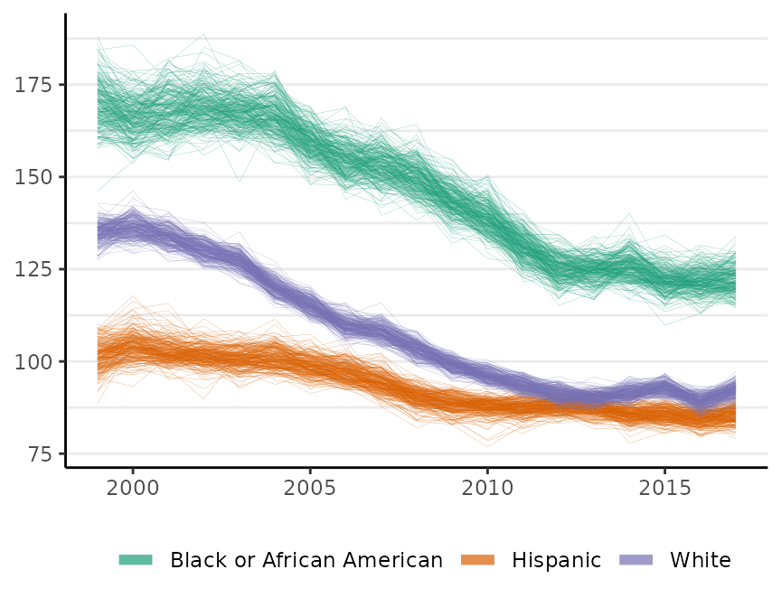
By default, M = 250 samples are plotted. The style option is available for all of the surveil plot methods.
Measuring pairwise inequality
surveil also provides a number of functions and methods for measuring health inequalities.
A selection of complementary pairwise inequality measures can be calculated using the group_diff function. The function requires a fitted surveil model and character strings corresponding, respectively, to the target population (indicating which group is the target of our inference, typically the overburdened or disadvantaged group), and the reference population. You can also use group_diff to compare two age-stratified populations with age-standardized rates (for details, see vignette("age-standardization") and ?group_diff).
It returns probability distributions and summary statements for the following quantities, where target and reference indicate disease risk for the respective populations:
- Rate Difference (RD): \(\text{Target} - \text{Reference}\);
- Population Attributable Risk (PAR): \(\frac{\text{RD}}{\text{Target}}\);
- Rate Ratio (RR): \(\frac{\text{Target}}{\text{Reference}}\);
- Excess Cases (EC): \(\text{RD} \times \text{[At Risk]}\).
Notice that the PAR is simply the rate difference expressed as a fraction of total risk; it indicates the fraction of risk in the target population that would have been removed had the target rate been equal to the reference rate (Menvielle, Kulhánová, and Machenbach 2019).
To calculate all of these measures for two groups in our data, we call group_diff on our fitted model:
gd <- group_diff(fit, target = "Black or African American", reference = "White")
print(gd, scale = 100e3)
#> Summary of Pairwise Inequality
#> Target group: Black or African American
#> Reference group: White
#> Time periods observed: 19
#> Rate scale: per 100,000
#> Cumulative excess cases (EC): 3,209 [2987, 3465]
#> Cumulative EC as a fraction of group risk (PAR): 0.27 [0.25, 0.28]
#>  time Rate RD  PAR  RR  EC
#>  1999  170 35 0.20 1.3  94
#>  2000  166 30 0.18 1.2  84
#>  2001  168 34 0.20 1.3 102
#>  2002  169 39 0.23 1.3 122
#>  2003  167 40 0.24 1.3 131
#>  2004  167 47 0.28 1.4 163
#>  2005  159 44 0.28 1.4 161
#>  2006  155 45 0.29 1.4 179
#>  2007  153 44 0.29 1.4 187
#>  2008  150 46 0.31 1.4 204
#>  2009  144 45 0.31 1.5 208
#>  2010  139 43 0.31 1.4 210
#>  2011  131 37 0.28 1.4 191
#>  2012  125 34 0.27 1.4 184
#>  2013  125 35 0.28 1.4 196
#>  2014  126 35 0.28 1.4 205
#>  2015  122 29 0.24 1.3 180
#>  2016  122 33 0.27 1.4 210
#>  2017  123 30 0.25 1.3 199
All of the surveil plotting and printing methods provide an option to scale rates by a custom value. By setting scale = 100e3 (100,000), the RD is printed as cases per 100,000. Note that none of the other inequality measures (PAR, RR, EC) are ever impacted by this choice.
The plot method for surveil_diff produces one time series ggplot each for RD, PAR, and EC. The means of the probability distributions for each measure are plotted as lines, while the shading indicates a 95% credible interval:
plot(gd, scale = 100e3)
#> Rate differences (RD) are per 100,000 at risk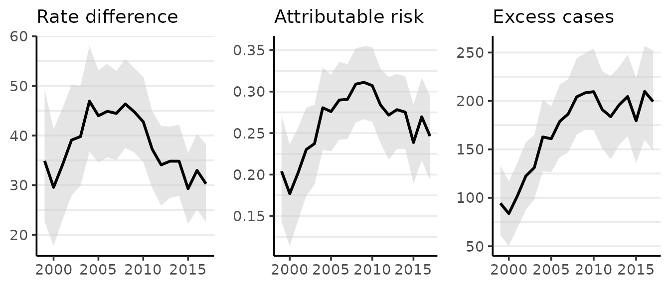
If we wanted to replace the plot of the PAR with one of the RR, we would set the PAR option to FALSE:
plot(gd, scale = 100e3, PAR = FALSE, style = "lines")
#> Rate differences (RD) are per 100,000 at risk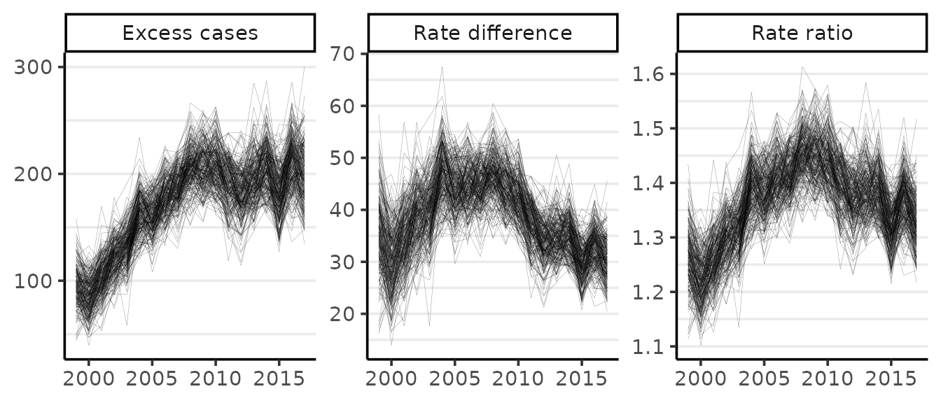
Measuring inequality with multiple groups
Pairwise measures are important, but they cannot provide a summary of inequality across multiple socially situated groups. Theil’s T is an entropy-based inequality index with many favorable qualities, including that it naturally accommodates complex grouping structures (Theil 1972; Conceição and Galbraith 2000; Conceição and Ferreira 2000).
Theil’s T measures the extent to which certain populations are overburdened by disease, meaning precisely that the proportion of cases accounted for by a particular group, \(\omega_j\), is higher than the proportion of the population constituted by that same group, \(\eta_j\). With \(k\) groups, Theil’s index is \[T = \sum_{j=1}^k \omega_j \big[ log(\omega_j / \eta_j) \big].\] This is zero when case shares equal population shares and it increases monotonically as the two diverge for any group. Theil’s T is thus a weighted mean of log-ratios of case shares to population shares, where each log-ratio (which we may describe as a raw inequality score) is weighted by its share of total cases.
Theil’s T can be computed from a fitted surveil model, the only requirement is that the model includes multiple groups (through the group argument):
Ts <- theil(fit)
print(Ts)
#> Summary of Theil's Inequality Index
#> Groups:
#> Time periods observed: 19
#> Theil's T (times 100) with 95% credible intervals
#>  time Theil .lower .upper
#>  1999 0.938  0.614  1.315
#>  2000 0.788  0.503  1.090
#>  2001 0.902  0.623  1.208
#>  2002 0.983  0.708  1.307
#>  2003 0.999  0.720  1.320
#>  2004 1.071  0.754  1.430
#>  2005 1.001  0.697  1.329
#>  2006 1.040  0.724  1.402
#>  2007 1.100  0.766  1.463
#>  2008 1.251  0.904  1.666
#>  2009 1.209  0.867  1.597
#>  2010 1.141  0.794  1.581
#>  2011 0.911  0.618  1.233
#>  2012 0.767  0.473  1.094
#>  2013 0.808  0.527  1.095
#>  2014 0.864  0.587  1.204
#>  2015 0.680  0.433  0.958
#>  2016 0.809  0.515  1.147
#>  2017 0.721  0.444  1.044
The probability distribution for Theil’s T can be summarized visualy using the "lines" style plot or by plotting estimates with shaded 95% credible intervals:
plot(Ts)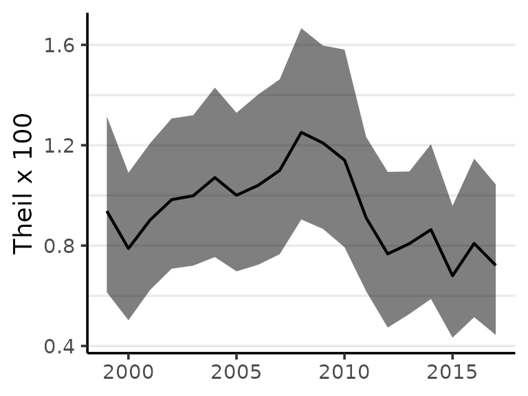
While the minimum of Theil’s index is always zero, the maximum value varies with the structure of the population under observation. The index is useful for comparisons such as monitoring change over time, and should generally not be used as a indication of the absolute level of inequality. Instead, percent change can provide a strong summary of results.
The index also has interesting extensions; for example, given disease data for a nested population structure—such as racial-ethnic groups within states—Theil’s index can provide a measure of geographic inequality across states (between-state inequality), and social inequality within states (within-state inequality) (Conceição, Galbraith, and Bradford 2001). For details, see ?theil.
References
Betancourt, Michael. 2017a. “A Conceptual Introduction to Hamiltonian Monte Carlo.” arXiv Preprint arXiv:1701.02434.
———. 2017b. “Diagnosing Biased Inference with Divergences.” Stan Case Studies 4. https://mc-stan.org/users/documentation/case-studies/divergences_and_bias.html.
Brandt, P, and JT Williams. 2007. Multiple Time Series Models. Sage.
Clayton, DG. 1996. “Generalized Linear Mixed Models.” In Markov Chain Monte Carlo in Practice: Interdisciplinary Statistics, edited by WR Gilks, S Richardson, and DJ Spiegelhalter, 275–302. CRC Press.
Conceição, Pedro, and Pedro Ferreira. 2000. “The Young Person’s Guide to the Theil Index: Suggesting Intuitive Interpretations and Exploring Analytical Applications.” University of Texas Inequality Project (UTIP). https://utip.gov.utexas.edu/papers.html.
Conceição, Pedro, and James K. Galbraith. 2000. “Constructing Long and Dense Time Series of Inequality Using the Theil Index.” Eastern Economic Journal 26 (1): 61–74.
Conceição, Pedro, James K Galbraith, and Peter Bradford. 2001. “The Theil Index in Sequences of Nested and Hierarchic Grouping Structures: Implications for the Measurement of Inequality Through Time, with Data Aggregated at Different Levels of Industrial Classification.” Eastern Economic Journal 27 (4): 491–514.
Gelman, Andrew, John B Carlin, Hal S Stern, David B Dunson, Aki Vehtari, and Donald B Rubin. 2014. Bayesian Data Analysis. Third. CRC Press.
Jaynes, Edwin T. 2003. Probability Theory: The Logic of Science. Cambridge University Press.
MacKay, David M. 2003. Information Theory, Inference, and Learning Algorithms. Cambridge University Press.
Menvielle, Gwenn, Kulhánová, and Johan P. Machenbach. 2019. “Assessing the Impact of a Public Health Intervention to Reduce Social Inequalities in Cancer.” In Reducing Social Inequalities in Cancer: Evidence and Priorities for Research, edited by Salvatore Vaccarella, Joannie Lortet-Tieulent, Rodolfo Saracci, David I. Conway, Kurt Straif, and Christopher P. Wild, 185–92. Geneva, Switzerland: WHO Press.
Stan Development Team. 2021. Stan Modeling Language Users Guide and Reference Manual, 2.28. https://mc-stan.org.
Theil, Henry. 1972. Statistical Decomposition Analysis. Amsterdam, The Netherlands; London, UK: North-Holland Publishing Company.